App Design 4 – Other Screens

ios home screen


Using Photoshop I added the IOS Icon onto a default iOS homescreen. I figured out that iOS uses Helvetica Neue in their UI design which is a bonus.


App Screen 3 Pedometer


I changed the bar at the top to green to show which section the user is in (pedometer in this example)

The boxes all have a grainy texture like handmade paper.

App Design – IOS Icon and Call Screen

I’ve constructed the IOS Icon

iPhone Retina Application Icon


I thickened the lines of the logo as before it was a little thin, I added the NHS logo as well for authenticity.


161158

I took this example image from google of a call screen on an IOS Device, i’ll use that to construct an example screen of someone calling their doctor.

(P.S. this is actually really difficult as the design choice on an IOS device blurs out whats behind the call screen and all the colours bleed out, I have no idea how to do that)

Main Hub - Call Screen


Alright so another update and i’m finished the call screen, all I needed to do was match the text and use the same UI from the example screen I took from google. I managed to (kind of) blur out the background as accurately as possible to a normal IOS design but not exactly. I used a mix of Gauss blur and duplicating the background image over and over again.

Also by this point i’ve started to collate the images into Adobe XD and started to link together the screens so when I press play on the simulation I can click on the buttons/icons and it’ll bring up their specific menu’s.

App Design 2 – Side Menu

App Screen 1 Loading


Jumping ahead I went and designed the loading screen before I went and designed the side menu, I made it simple and used a rich blue similar to the NHS Logo, put a black and white gradient over the top and added a faint diagonal pattern.

The Lettering required a bit more work, I used Illustrator to design it.

Heart Smart Text


I needed a guide from the internet for this one, I’m not experienced very well in using the 3D tool (as seen in one of the earlier posts with the logo design). one of the layers is 3D, the rest are made up of pattern and solid layers to kind of create a sort of colourful medley.

step-5

That was the example used in the guide (I really liked the design so I borrowed from it)


Heart Smart Text PS


Then I just added some final touches in photoshop, I added an inner shadow and a light diagonal pattern.


Main Hub - Profile Bar


The side menu didn’t take me long to make, all was required was a few boxes and shapes to put it together. Still haven’t decided what content to put in the side-bar though. it’s meant to be a profile box.

App Design 2

App Screen 2 Main Hub


After much work the Main hub has been completed!!

Again more changes (obviously) i’ve added a phone option in the top left for the user to contact their doctor, and a side menu option on the right for the user to check their account.

The Purple and Blue buttons have been decided. There’s an option to count your calories to see how much the user consumes in a day. Keeping your heart healthy means choosing the right diet so that option will aid the cause of the campaign. I’ve also cleverly used a piggy bank which is both a metaphor for money and banking but also pigging out (eating as much as you can, like a pig)

For blue I’ve added a Smart Band section allowing the user to resync/interact with their band.

p.s.

It’s now Vertical Stripes for the Calorie Bank

and Diagonal Stripes for Notifications (seeing as it looks more alarming, hence the use of the bell)

Something not previously mentioned was that i’ve added a phone bar at the top like an actual IOS device. Plus I added a little copyright bar at the bottom you sometimes see with applications.

Next i’m going to design some of the option screens people can get to once they click on things, i’m gonna start off with the side bar I think.

App Design 101

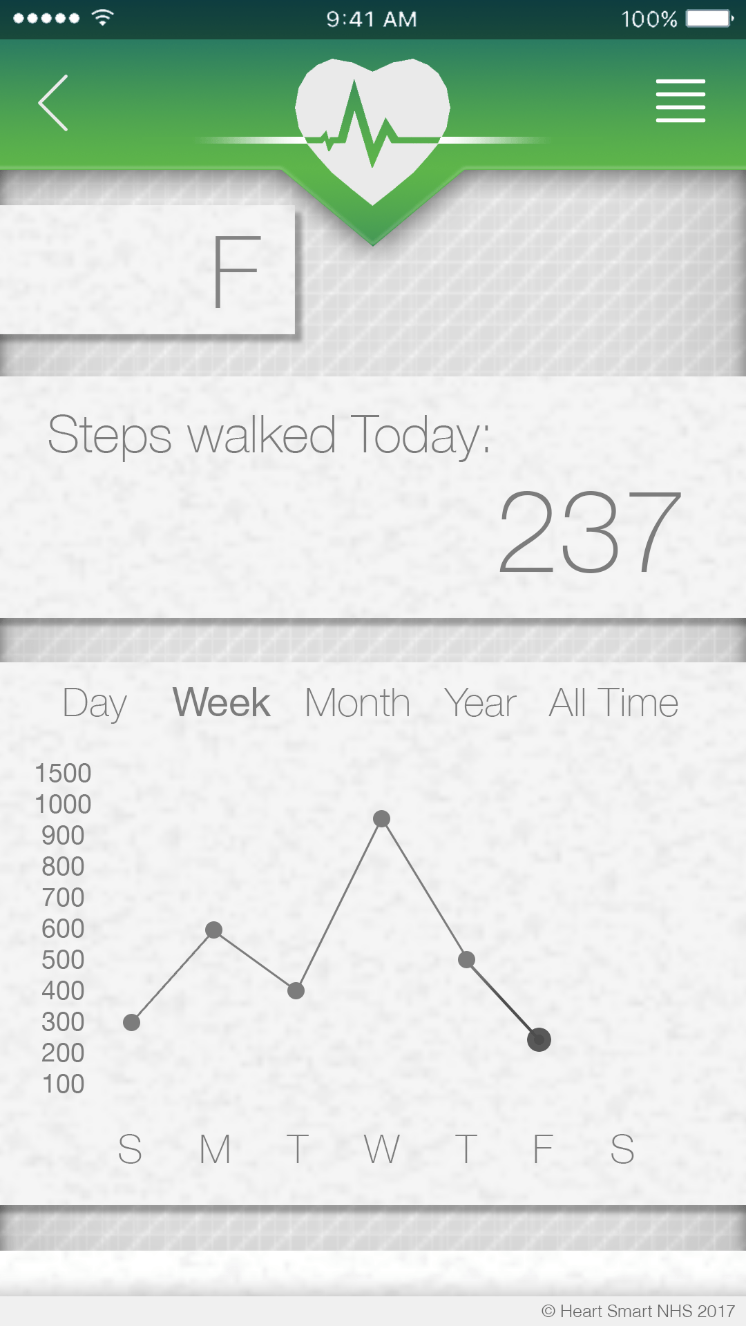
Alright so I’ve started working on the application for the Heart Smart Band

Screen Shot 2017-04-16 at 22.16.11


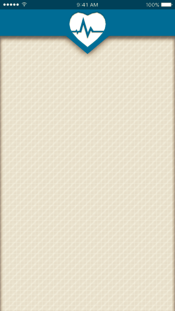
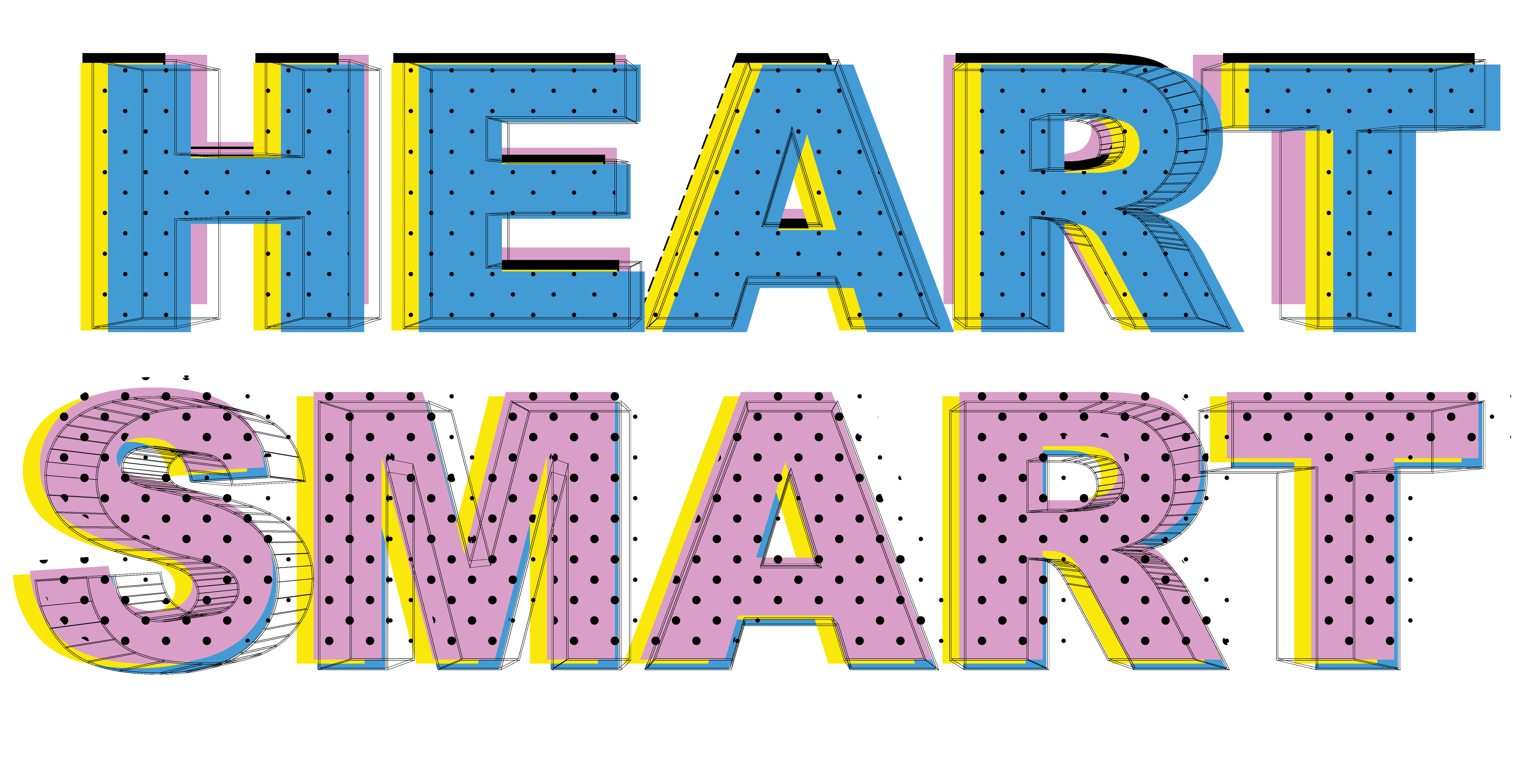
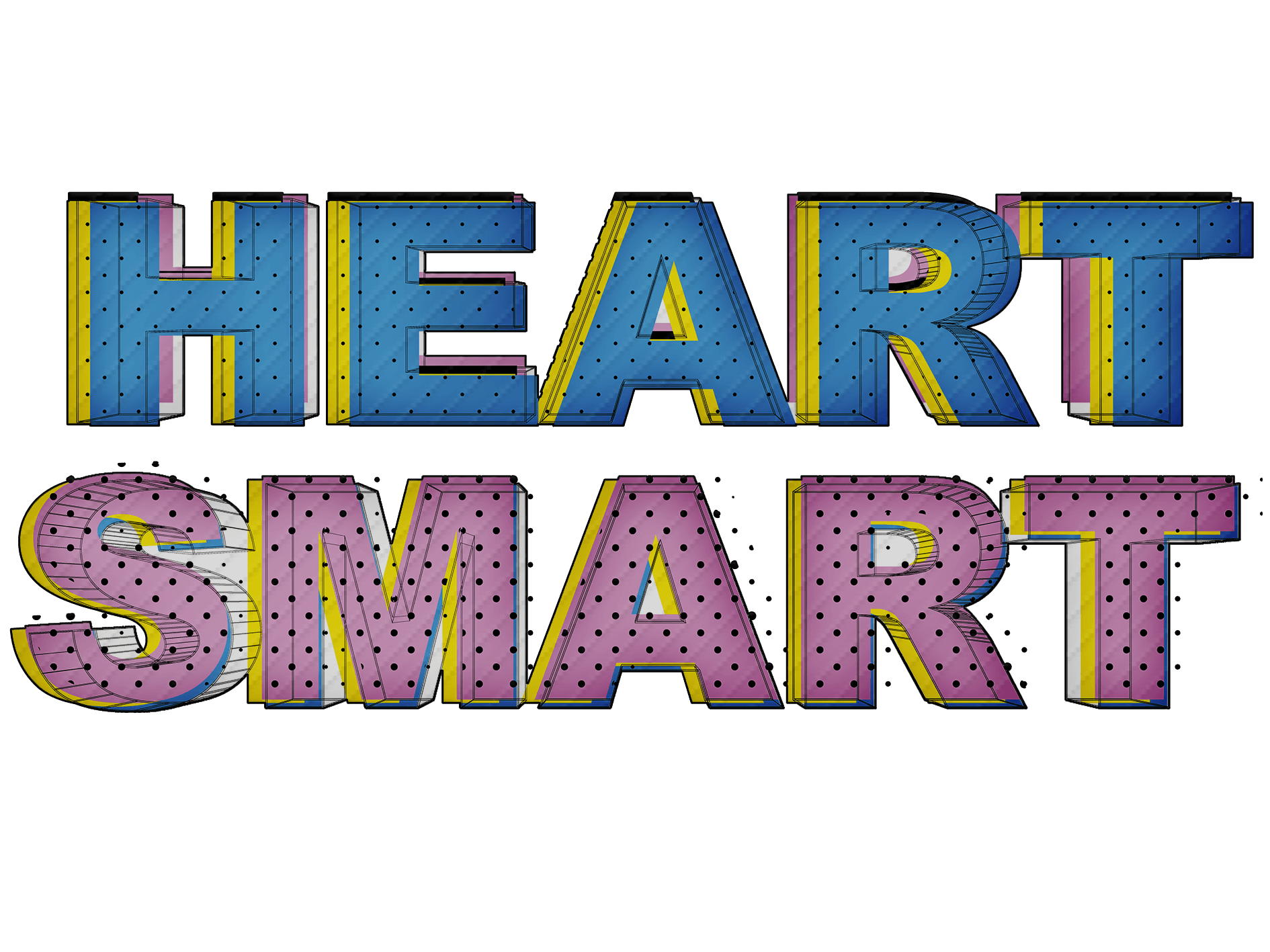
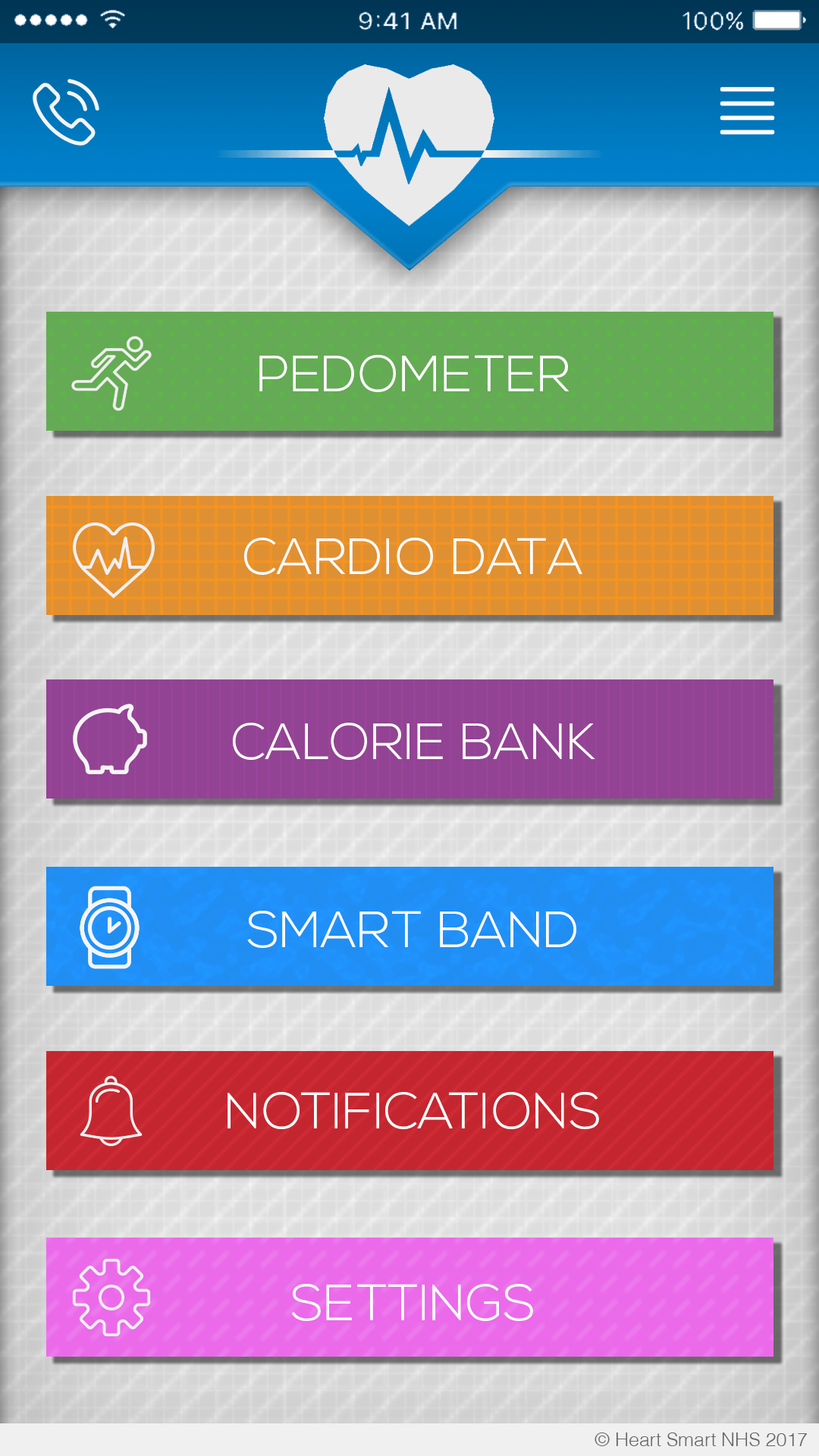
Originally the logo used at the top was just the logo previously used in the app icon but I thought it looked better in plain white. Good UI design is always a major factor in making sure people use your app so I’ve lifted the top bar from the background using a drop shadow, the backdrop itself has three pattern layers, 2 grid layers, and one diagonal layer. I’ve used the same blue thats used in the NHS logo to fit the theme (seeing as it’s meant to be an NHS app).

18009386_10154831524983300_1781225458_n


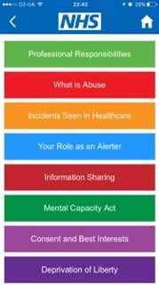
I’m gonna use the colour scheme that this NHS advice app has used, it’s vibrant and colourful which should be appealing to kids.

Screen Shot 2017-04-17 at 02.57.53


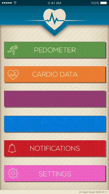
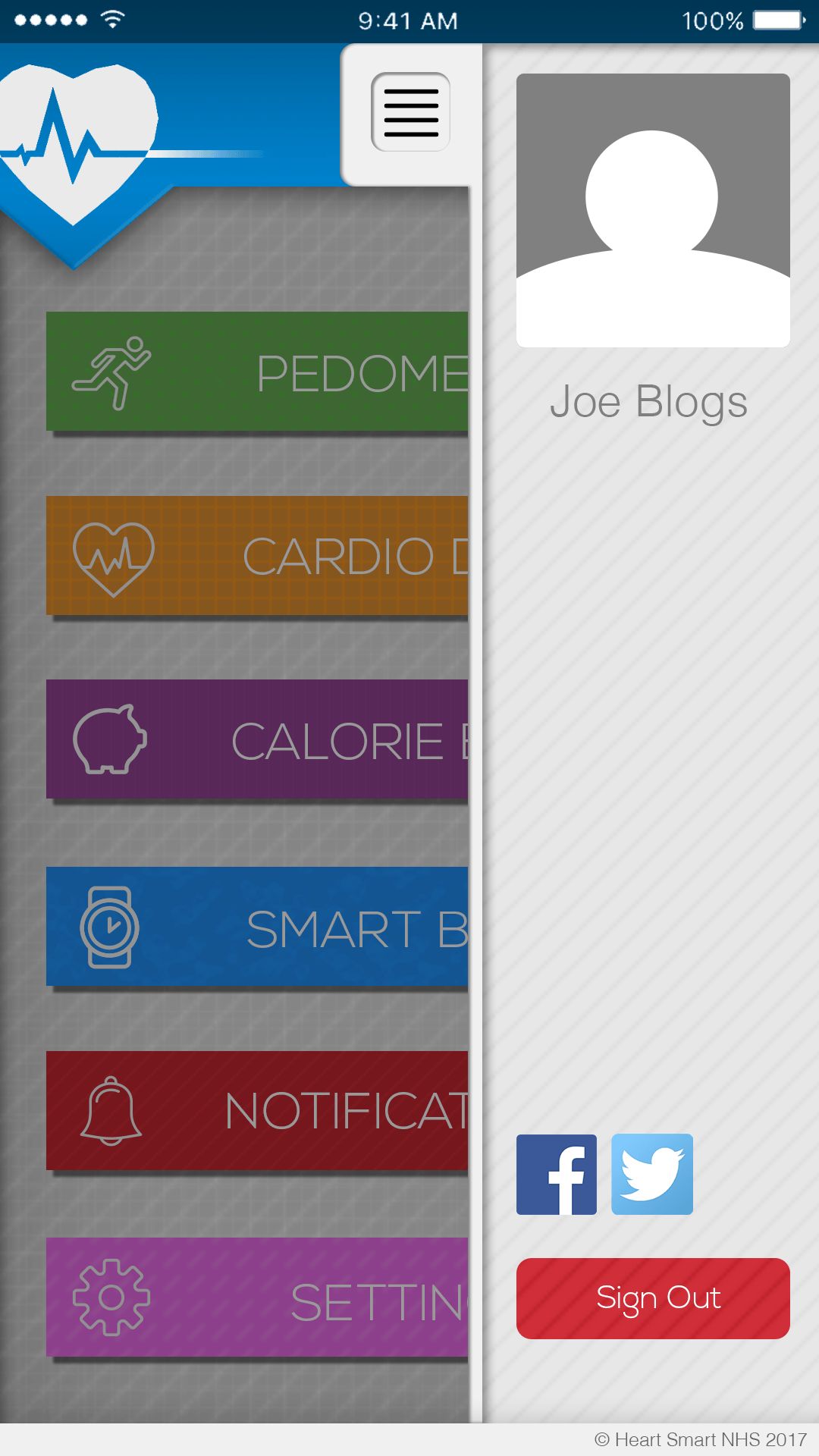
New update, Buttons have been added all with drop shadows to lift them from the page. I’ve also added some shading in the header as well with a light stroke around the edge to finish it, I had a long think about whether or not I needed the gradient line in the middle of the logo in the middle, I can’t quite decide if it’s too fussy or if it actually adds to the design itself. I’ve used Nexa Light (16pt) for the letter work on the buttons. It’s smart without looking too overly formal, plus it comes in an ultra thin version which works perfectly for the aesthetic. (it matches the thickness of the Icons)

All of the buttons have specific patterns matched to them depending on their colour.

Spots for Pedometer

Grids for Cardio Data

Boxes for Purple (haven’t decided what will be there yet)

light splatters for Blue (same here)

Vertical Stripes for Notifications

and Diagonal strokes for Settings

All the icons that were used were sourced from Flaticon.