I’ve constructed the IOS Icon
![]()
I thickened the lines of the logo as before it was a little thin, I added the NHS logo as well for authenticity.
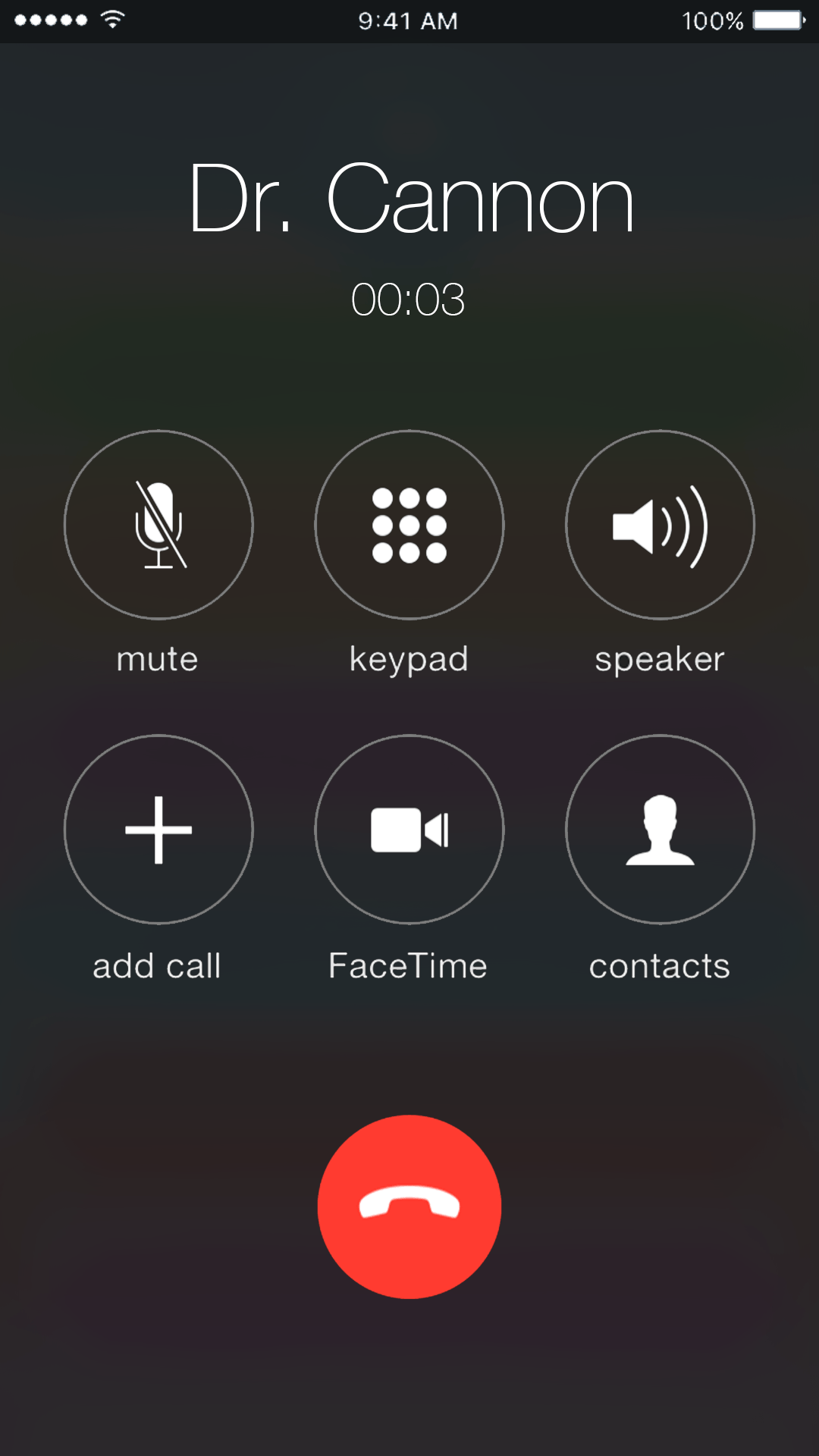
I took this example image from google of a call screen on an IOS Device, i’ll use that to construct an example screen of someone calling their doctor.
(P.S. this is actually really difficult as the design choice on an IOS device blurs out whats behind the call screen and all the colours bleed out, I have no idea how to do that)
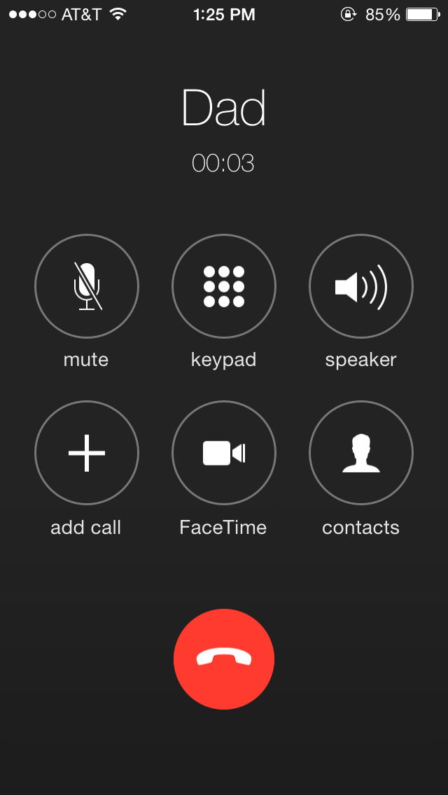
Alright so another update and i’m finished the call screen, all I needed to do was match the text and use the same UI from the example screen I took from google. I managed to (kind of) blur out the background as accurately as possible to a normal IOS design but not exactly. I used a mix of Gauss blur and duplicating the background image over and over again.
Also by this point i’ve started to collate the images into Adobe XD and started to link together the screens so when I press play on the simulation I can click on the buttons/icons and it’ll bring up their specific menu’s.