After much work the Main hub has been completed!!
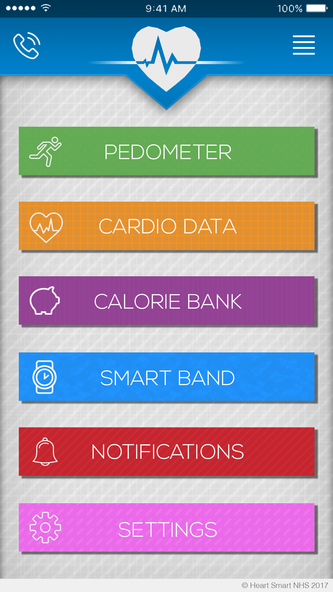
Again more changes (obviously) i’ve added a phone option in the top left for the user to contact their doctor, and a side menu option on the right for the user to check their account.
The Purple and Blue buttons have been decided. There’s an option to count your calories to see how much the user consumes in a day. Keeping your heart healthy means choosing the right diet so that option will aid the cause of the campaign. I’ve also cleverly used a piggy bank which is both a metaphor for money and banking but also pigging out (eating as much as you can, like a pig)
For blue I’ve added a Smart Band section allowing the user to resync/interact with their band.
p.s.
It’s now Vertical Stripes for the Calorie Bank
and Diagonal Stripes for Notifications (seeing as it looks more alarming, hence the use of the bell)
Something not previously mentioned was that i’ve added a phone bar at the top like an actual IOS device. Plus I added a little copyright bar at the bottom you sometimes see with applications.
Next i’m going to design some of the option screens people can get to once they click on things, i’m gonna start off with the side bar I think.