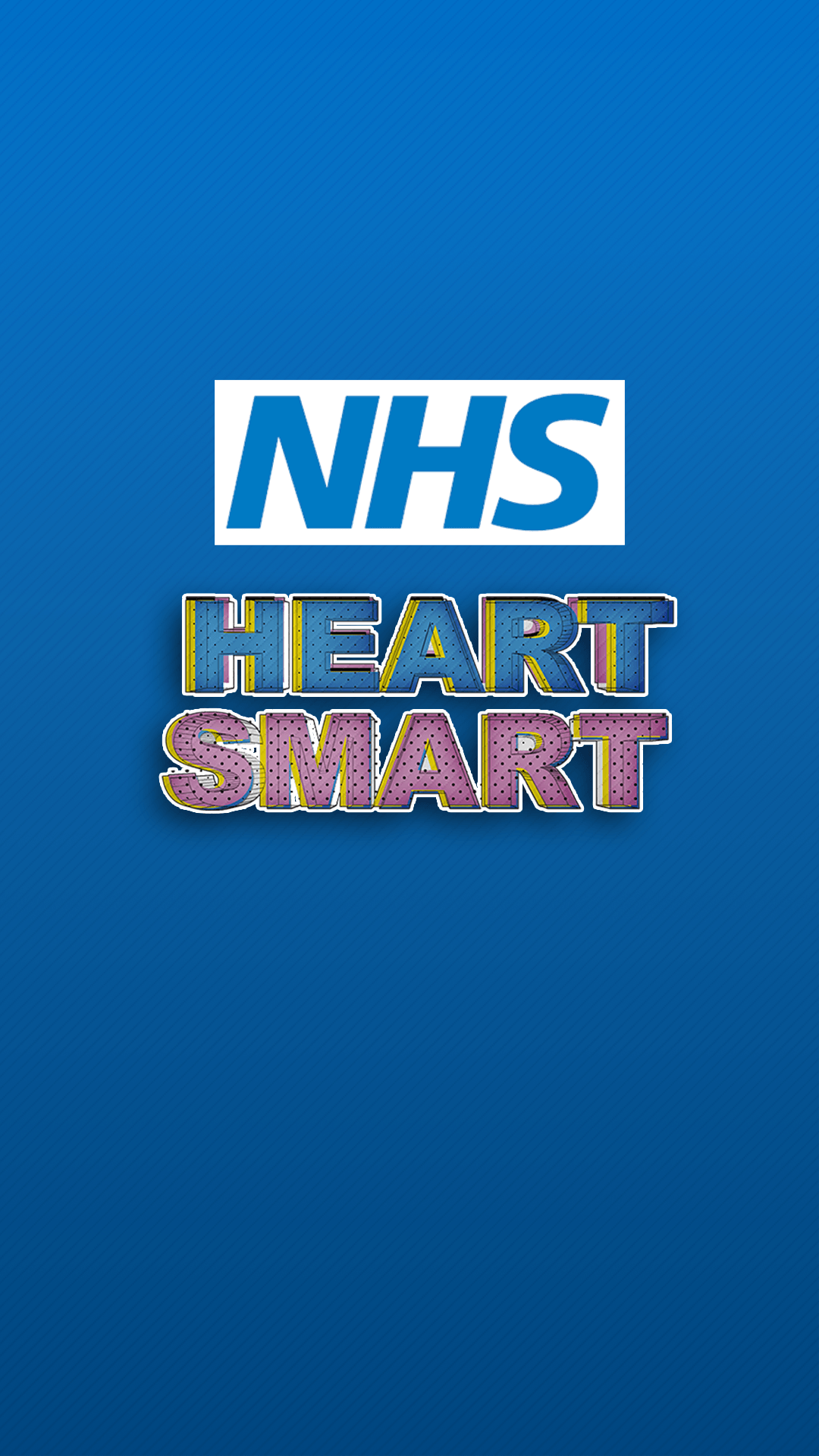
Jumping ahead I went and designed the loading screen before I went and designed the side menu, I made it simple and used a rich blue similar to the NHS Logo, put a black and white gradient over the top and added a faint diagonal pattern.
The Lettering required a bit more work, I used Illustrator to design it.
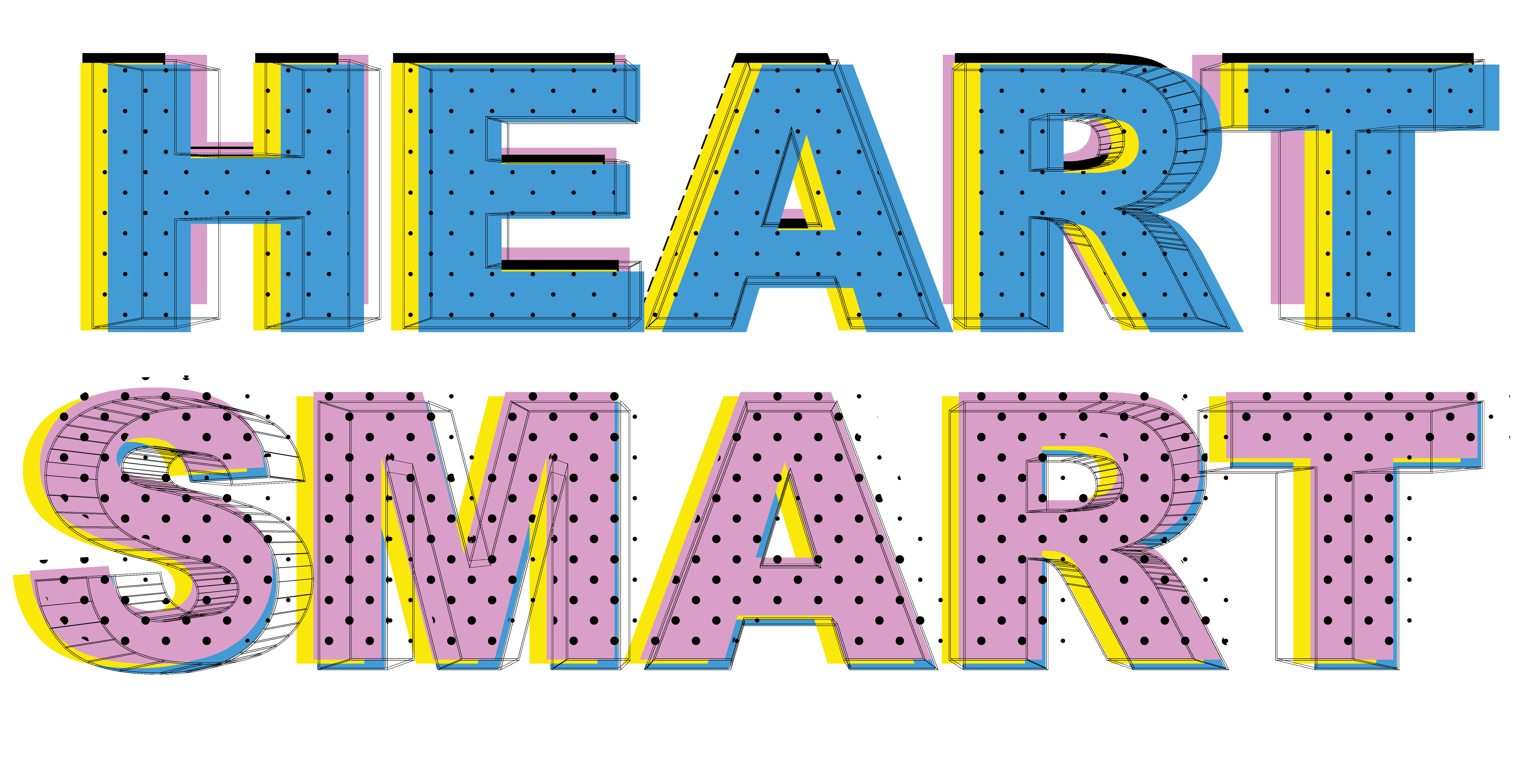
I needed a guide from the internet for this one, I’m not experienced very well in using the 3D tool (as seen in one of the earlier posts with the logo design). one of the layers is 3D, the rest are made up of pattern and solid layers to kind of create a sort of colourful medley.

That was the example used in the guide (I really liked the design so I borrowed from it)
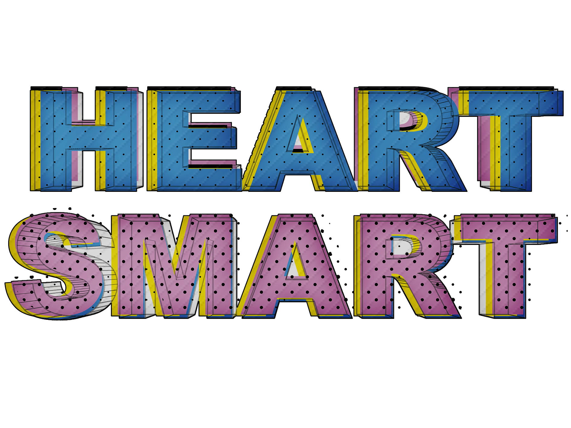
Then I just added some final touches in photoshop, I added an inner shadow and a light diagonal pattern.
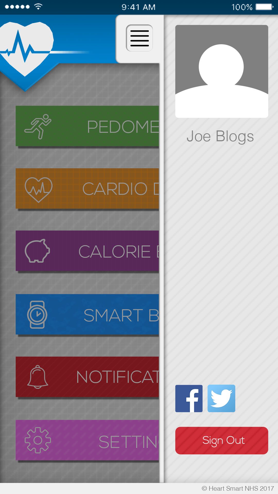
The side menu didn’t take me long to make, all was required was a few boxes and shapes to put it together. Still haven’t decided what content to put in the side-bar though. it’s meant to be a profile box.