Alright so I’ve started working on the application for the Heart Smart Band
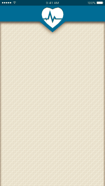
Originally the logo used at the top was just the logo previously used in the app icon but I thought it looked better in plain white. Good UI design is always a major factor in making sure people use your app so I’ve lifted the top bar from the background using a drop shadow, the backdrop itself has three pattern layers, 2 grid layers, and one diagonal layer. I’ve used the same blue thats used in the NHS logo to fit the theme (seeing as it’s meant to be an NHS app).
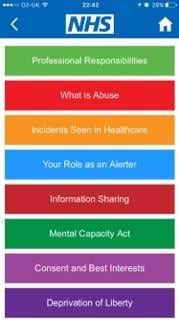
I’m gonna use the colour scheme that this NHS advice app has used, it’s vibrant and colourful which should be appealing to kids.
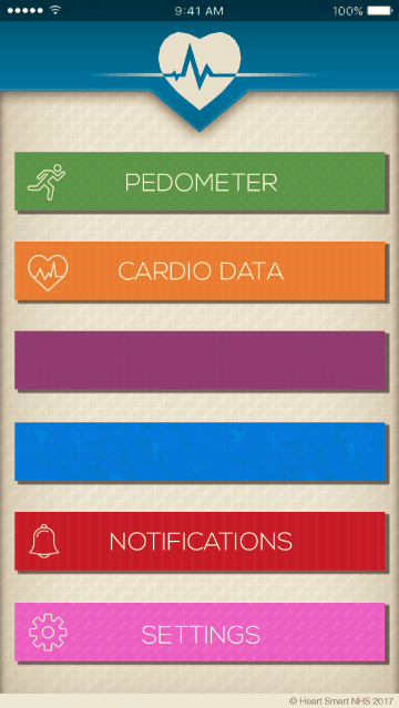
New update, Buttons have been added all with drop shadows to lift them from the page. I’ve also added some shading in the header as well with a light stroke around the edge to finish it, I had a long think about whether or not I needed the gradient line in the middle of the logo in the middle, I can’t quite decide if it’s too fussy or if it actually adds to the design itself. I’ve used Nexa Light (16pt) for the letter work on the buttons. It’s smart without looking too overly formal, plus it comes in an ultra thin version which works perfectly for the aesthetic. (it matches the thickness of the Icons)
All of the buttons have specific patterns matched to them depending on their colour.
Spots for Pedometer
Grids for Cardio Data
Boxes for Purple (haven’t decided what will be there yet)
light splatters for Blue (same here)
Vertical Stripes for Notifications
and Diagonal strokes for Settings
All the icons that were used were sourced from Flaticon.


